
Everything You Need to Know About Complementary Colors
The color wheel is one of the first things we ever learn in art class, marking the importance for budding art and design aficionados of all levels to have an understanding of complementary colors. This wheel emphasizes the combination of opposing colors to create a uniquely beautiful color palette, whether that’s on a canvas or in a bedroom. However, there is more than just artistic meaning behind the designation of complementary colors — there are actually scientific theories to support these pairings! Read along to learn more about complementary colors and how to use them in your home’s design.
What are Complementary Colors?
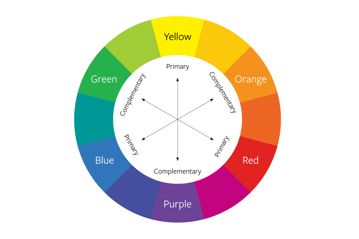
There are three traditional sets of complementary colors, as derived from the primary Red-Yellow-Blue (RYB) color model:
- Red and green
- Yellow and purple
- Orange and blue
You can see them positioned opposite one another on the color wheel above. Note that there are various color models, on top of RYB, which produce different complements. For example, within the additive model of color, the complements are green and magenta, red and cyan, and blue and yellow (IKEA, anyone?).
Complementary colors can be used in myriad ways for artists and designers, as they can create a focal point in any room or be mixed together on a palette to create an appealing neutral.
What Is Blue’s Complementary Color?
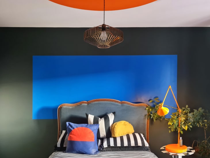
Because of the high contrast, blue’s complementary color is orange. These opposing warm and cool tones emphasize one other when styled in the same space.
What Is Red’s Complementary Color?
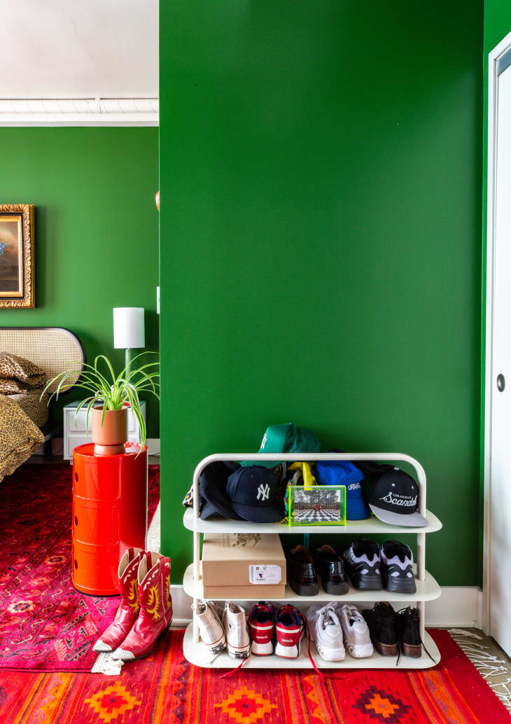
Red and green are complementary colors. Soothing, nature-inspired green hues help highlight this fiery tone, no matter the shade or saturation.
What Is Yellow’s Complementary Color?
Both arguably underrated colors when it comes to interior design, yellow and purple complement each other. Even more muted, subdued iterations of this color pairing — like lilac — can make a big impact.
How Do Complementary Colors Work?
Complementary colors, when used together in color schemes, are especially dynamic and pleasing to the eye. This is because different types of cones (the photoreceptor cells in your eye that contribute to color vision) perceive different colors of light. If you stare for a long time at a block of color and then quickly look at a white wall, you’ll see a light afterimage in the opposite, or complementary, color.
How Does a Light Afterimage Work, Exactly?
Let’s say you’re staring at a blue square. After a while, the cells in your eye that process blue light will become fatigued, making the signal sent to your brain slightly weaker. Since that part of the visual spectrum has become slightly suppressed, you’ll now see a faint orange afterimage when you look at a white wall after staring at the blue square. What you’re actually seeing is the white spectrum of light from the wall, minus a tiny bit of blue, which your brain processes as orange.
How to Use Complementary Colors in Your Home
So what does this mean for the decorator? It means that combinations of complementary colors are especially dynamic together, since they play up each other’s intensity. A tiny bit of orange really pops in a blue room (and vice versa) because your eye wants to see that color. A combination of two complementary colors may be perceived as soothing or balanced, since it simultaneously stimulates different parts of the eye. Check out some of the examples below.
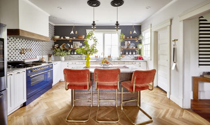
How to Mix Orange & Blue
Orange and blue may seem like quite the odd couple, but they can actually make a dynamic duo when paired in the right shades. Here, Kate Pearce uses this bold color pairing in the kitchen of her Long Island home to bring a vibrant, unexpected pop in this otherwise neutral, understated cookspace. Additionally, a combination found in nature such as terracotta and sky blue (often seen in the American Southwest) can be a beautiful combination for a more soothing aesthetic.
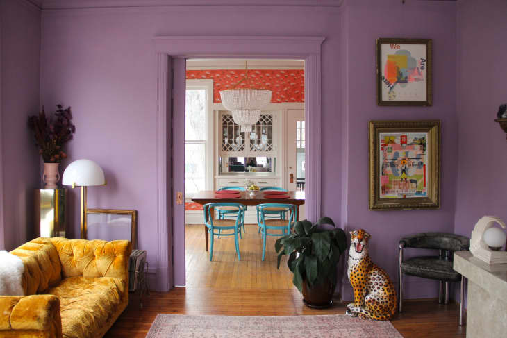
How to Mix Yellow & Purple
Yellow and purple can be a stylish color combination when they aren’t competing for attention. Two designer-favorite pairings include a sunny citron with a muted purple and gold with a warm lavender, as shown above in this Chicago Victorian home. Pick one to be the star of the show or let both be muted to create a daring but successful color palette.
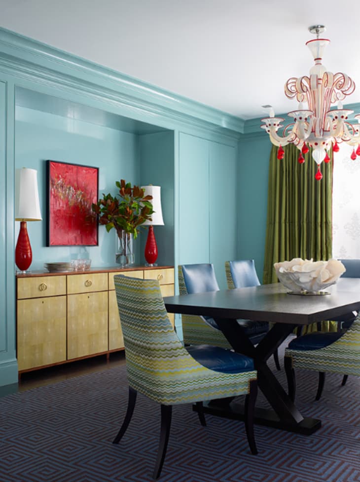
How to Mix Red & Green
One of the most iconic color pairings, red and green is a complementary color combination most of us don’t want to touch between New Year’s Day and Thanksgiving. As shown in this beautiful dining room by Katie Ridder, it may help to bring in another key color to your palette to create balance and stave off a Christmastime motif. You could also bring plant life into a room with red walls or furniture to get the look.