
Launching Today: First Look at the Nine Brand New Farrow & Ball Paint Colors
One of the things that Farrow & Ball is known for is its very carefully edited, strict palette of 132 paint colors, which, in a show of true British prudence, care and custom, is added to quite infrequently. Well, color lovers can rejoice, because today is one of the rare occasions where their colour card is updated. Nine new colors are being released in celebration of the brands 70th anniversary year and we’ve got them to share.
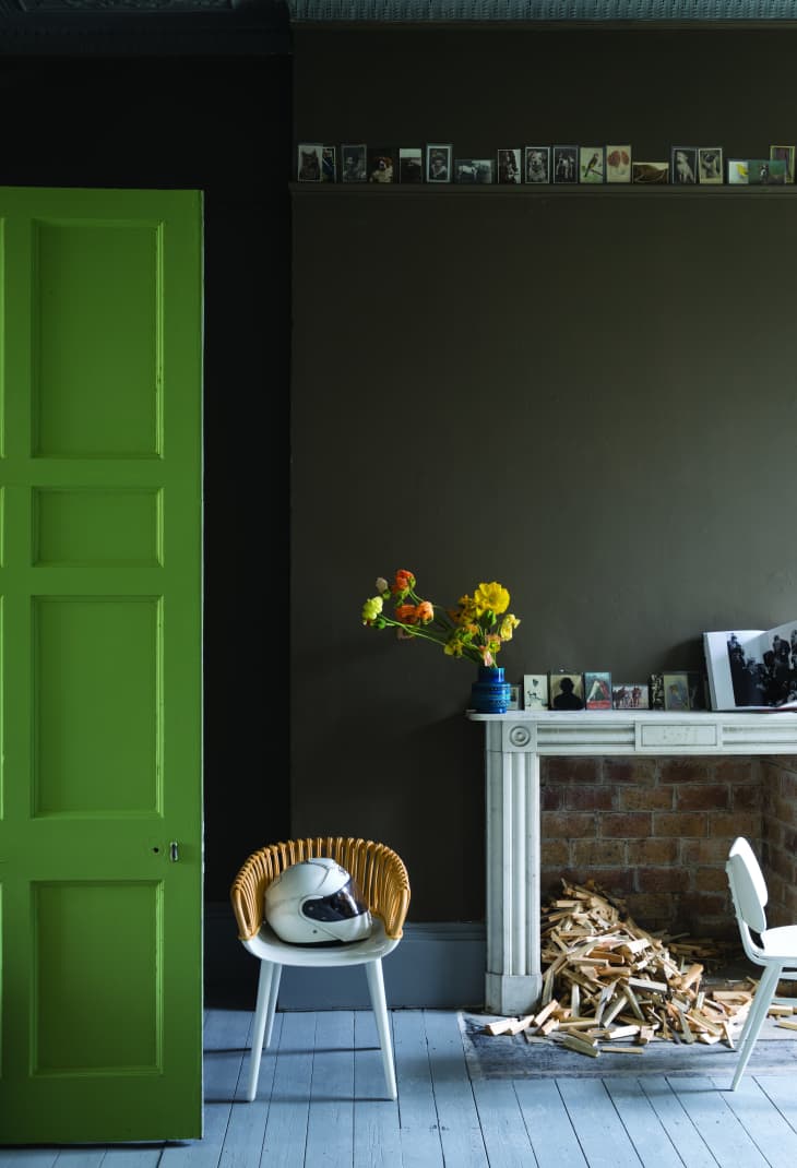
Shown above, at the top of the post, is the drop dead gorgeous Salon Drab #290. According to Farrow & Ball, “Its richness is extremely appealing and will create rooms that have mid-19th century authenticity despite being perceived as the perfect ‘chocolate’ for the modern home.” Tips for use: good for darker north facing rooms and works well with yellow and red based neutrals.
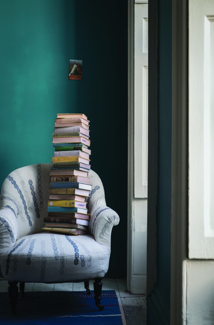
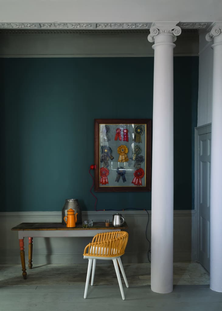
Vardo #288 is a rich deep teal that, to me, has a very pleasantly vintage look. Tips for use from Farrow & Ball: works well with reds and dark grays.
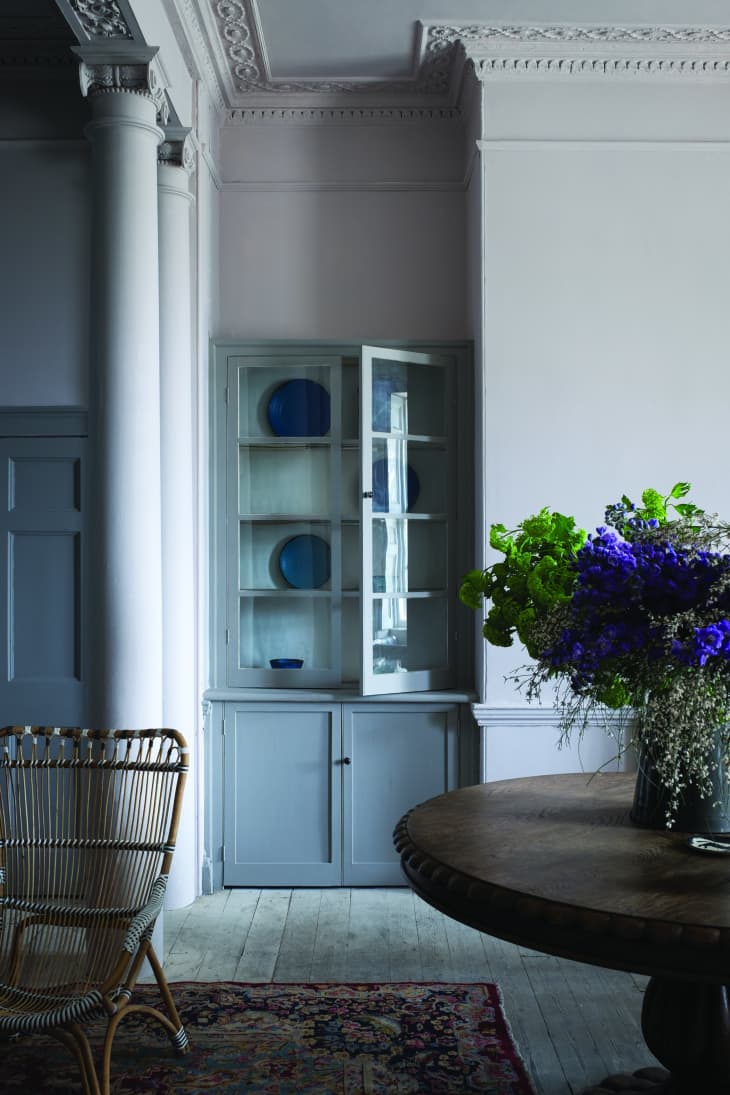
I’m in love with Peignoir # 286! This is the most subtle pink-gray I’ve ever seen; a perfect way to make the current lust for gray as a neutral a touch more modern. Tips for use: works well combined with white in south facing rooms.
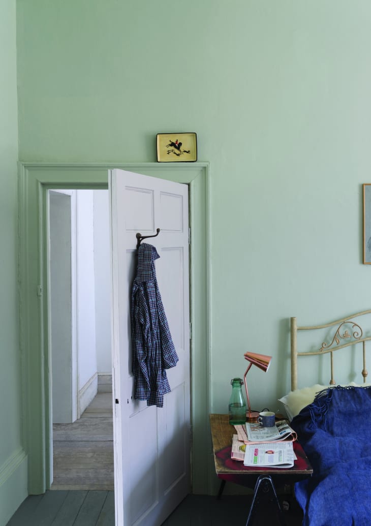
The simple warm look of Shadow White #282 is so good. Designed to not read as too yellowish or gray, it is a rich but simple to use neutral. Tips for use: south facing rooms will accentuate the soft shaded look of the color.
And if you like Shadow White, you may be even more interested in Drop Cloth #283, which is a darker version of the color.
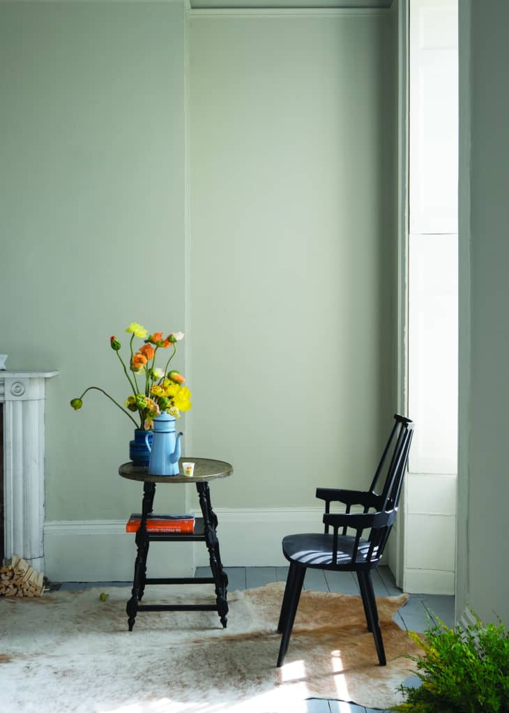
Cromarty #285 is a sweet minty blue pastel color. Described by Farrow & Ball as “not too blue or too gray”. Tips for use: can read as very neutral when desired, but it warms up when used in a west-facing room.
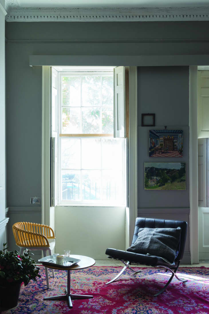
Worsted #284 is a pale stone color. Tips for use: looks good with strong white accents and when used in north facing room, deepens to stronger gray tone.
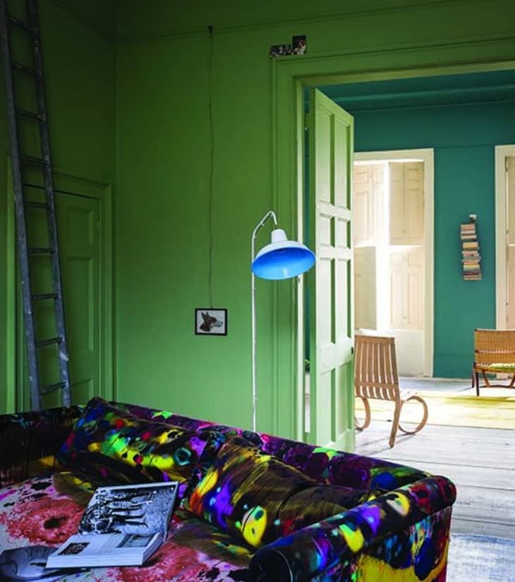
Yeabridge Green #286 is based on a color found at an 18th century farmhouse. Described by Farrow & Ball as the “cleanest, freshest and most uncomplicated” of their greens. Tips for use: Northern lit rooms will give it an earthier tone.
Inchyra Blue #289 is a grayish, greenish blue that can work as a stand in for some of the currently popular darker “new neutrals” such as gray. Tips for use: the color will appear the most “blue” in west facing rooms later in the day.
And, there we have it – nine new colors to dream about. I’m already plotting where I can fit Peignoir (and maybe Salon Drab!) into my place. Any other early favorites out there?
More info on the new colors: Farrow & Ball